AdRoll vs. MNTN
How do AdRoll and MNTN compare when it comes to features, pricing, pros, cons, and use cases? We’ve got the answers.
Read More
Let’s be honest: We’re all culprits of online window shopping. In today’s digital age, it’s all too easy to mindlessly scroll through an ecommerce site as a solution to boredom or procrastination. Yet, more often than not, we end up closing the tab without checking out or even adding items to the cart.
If you’re reading this, you’re probably also familiar with what’s happening behind the scenes: a team of nervous marketers watching as their ad spend creeps up without a corresponding rise in sales. Ouch. Luckily, worries about low conversion rates and marketing resources wasted on window shoppers will soon become annoyances of the past — say hello to browse abandonment emails, a powerful tool to capture lost revenue.
This guide covers everything you need to know about browse abandonment emails, including what they are, why they work, and how to craft buzzy ones that will generate more customers and conversions. Let’s get started!
In this article:
What Is Browse Abandonment?
What Are Browse Abandonment Emails?
Pros and Cons of Browse Abandonment Emails
How Can I Craft Effective Browse Abandonment Emails?
Goodbye Browse Abandonment, Hello Conversions!
Browse abandonment happens when someone visits your ecommerce site but ultimately exits the page without making a purchase or even adding products to their carts. While on your site, they may:
| The most common types of abandonment emails | |
| Cart abandonment emails | For shoppers who add items to their carts but do not complete the checkout process |
| Browse abandonment emails | For shoppers who engage with your site but do not add items to their carts before leaving the page |
| Product abandonment emails | For shoppers who land on specific product pages, then exit the site (Note: Product abandonment emails allow for more targeted messaging compared to a general browse abandonment approach.) |
When targeting browse abandonment, you should deploy a multi-channel strategy with:
For more on triggered emails:
If you’re an avid online shopper, you’ve likely received browse abandonment emails before. Similar to cart abandonment emails, browse abandonment emails are sent to email subscribers who have engaged with your website but did not continue with the shopping process for whatever reason — indecisiveness and distraction are common ones.
If you already have a cart abandonment solution in place, that’s an awesome first step. But here’s the harsh reality: Most shoppers don’t make it that far. By supplementing your cart abandonment emails with browse abandonment emails, you can capitalize on the intent of shoppers who are in the early-to-mid stages of their customer purchase journey (and may require a few additional marketing nudges and reminders before continuing down the funnel).
As with any marketing tool or tactic, there are upsides and downsides to browse abandonment emails:
We’re huge fans of email marketing here at AdRoll. After all, the numbers speak for themselves — for every $1 spent, the return is close to $42; emails are, indisputably, one of the most effective ways to generate revenue. With browse abandonment emails aimed at shoppers who have expressed an interest in your brand and products, you can save on paid retargeting costs.
The best things never come easy and browse abandonment emails are no different. Unlike social and search retargeting, you are required to obtain permission from shoppers before reaching out via email. In other words, you can only send browse abandonment emails to shoppers who are existing email subscribers.
Unfortunately, with all the changes to third-party cookies and digital privacy, today’s online shopper is stingier than ever with their personal information. Marketers looking to send any type of abandonment trigger email must think of out-of-the-box ways to obtain first-party data from their target customers. (We’ve got you covered with some ideas below.)
Digital marketers are strapped for time — but before you think about how much work is involved, remember that browse abandonment emails can be quickly automated. With just a bit of upfront strategy and creativity (and tweaking after monitoring your results), you can design a robust browse abandonment email series that will attract window shoppers.
Average office workers receive an astonishing 100 emails a day — making the act of email marketing no longer just a tactic but also an art. Don’t want to find your hard work in shoppers’ Trash folders? You don’t need an MFA to stand out from the noise. Instead, strategy, creativity, and expert copywriting can all help. Just follow these tips, and you’ll be on your way to a successful browse abandonment email campaign:
Obtaining permission is the key to successful browse abandonment email campaigns. Without effective email capture strategies, any successful results will be limited to the handful of customers you have on your list.
Give people a good reason to offer their email addresses, such as:
It’s also helpful to add language that alleviates hesitations shoppers may have that are stopping them from sharing their email addresses, such as:
Acknowledge that email marketing is an act of trust — be as transparent as possible about how you will treat, store, and use people’s information.
For more on how to build your email list (and why it matters):
With browse abandonment emails reaching a much larger audience pool compared to cart abandonment emails, personalization is the easiest way to ensure that your messaging is relevant, useful, and click-worthy. In fact, brands see a 289% increase in conversions when they personalize recommendations in an email body — that’s huge!
And even though browse abandoners may not have added specific items to their carts, you still have a treasure trove of data that can guide your personalized recommendations, including:
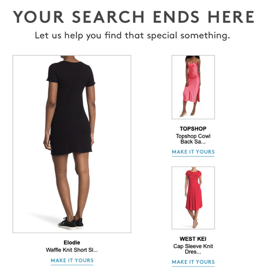
Nordstrom Rack’s browse abandonment emails include personalized product recommendations with copy that feels helpful and relevant.
With this information, you (or more specifically, your automation platform) can paint a clear picture of what the shopper wants or needs. Then you can:
We’re devoting less time to opening promotional emails, which means subject lines can make or break your entire browse abandonment email strategy. Of course, your subject lines will depend on your product and brand, but here are some for inspiration:
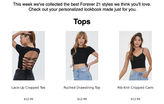
Forever 21’s browse abandonment emails are designed as weekly “personalized lookbooks” with the email subject line: “Babe, We Picked These Just For You 💛✨”
Try to personalize subject lines whenever possible — they’ll generate a 50% greater open rate.
And, as with any marketing email — whether to announce a promotion or to recover abandoned carts — keep your subject lines short and sweet. You want to drive just enough intrigue to compel them to check out what’s inside.
Lastly, remember that your browse abandonment email should serve as a friendly nudge and reminder. You’re targeting shoppers who may be new to your brand — don’t be too aggressive or promotional.
For more on crafting engaging subject lines:
Have you noticed more email subject lines written with exclamation points (!!!!), ALL CAPS, or even bright red emojis, like 🚨or 🔥? That’s because urgency works — but only when used appropriately and sparingly.
While you’ll want to stray away from panic-inducing headlines, you can create a sense of urgency in your email body by:
Beyond promoting products, you can use your browse abandonment emails to highlight your value propositions, whether it’s:
Chewy’s emails include a succinct footer that states its value propositions in a clear and concise way.
You’ll want to sprinkle these tidbits in the email body rather than make it the focus of your email — specific products or product categories should remain the priority.
Different types of email marketing warrant different frequencies. Studies show that brands that send three abandoned cart emails, compared to only one, will see 69% more orders. Sometimes, customers appreciate the additional follow-up.
However, browse abandonment emails must be approached differently. Browse abandoners are at the top of your shopping funnel, which means their intentions to complete their purchase may be relatively low. You’ll want to refrain from going overboard by designing a multi-message series and bombarding them with email after email about products they had just absent-mindedly clicked on.
Therefore, we recommend sending one to two encouraging reminders to serve as a little nudge. Because the success rate of any abandonment email significantly diminishes as time passes, you’ll want to send out the first abandonment email sooner rather than later, preferably within two hours of a shopper exiting the page. Then, send your second follow-up email 24 hours after they abandon the page.
It’s all about matching the level of interest to your email frequency and remembering that less is more. After all, you have other tools at your disposal as well. (Remember those nifty retargeting ads?)
For more on ideal email cadences:
About 80% of retailers cite email as the most effective marketing channel, and we have to agree. With browse abandonment emails, gone are the days where you let digital window shoppers stroll through your online store without telling them, “Wait, we’ve got what you want!”
Creating a browse abandonment email series is simple when you’re equipped with the right automation tools, helping you send the perfect message to the perfect shoppers at the perfect time.
Last updated on January 30th, 2025.


