As the marketing and ecommerce industries move away from third-party cookies, first-party data has taken over. If data is the goal, then email addresses and phone numbers are the jackpots.
But asking for people’s personal data is tricky business. While some consumers will begrudgingly click the “accept all cookies” button, others will be wary about where their information will land — nobody wants to get bombarded with spam emails, push notifications, and text messages.
It doesn’t have to be this way, though. The first step? Design irresistible contact captures that set honest expectations — for that, keep these seven tips in mind.
But First, What Is a Contact Capture?
A contact capture is a form on your website or app that gathers a user’s information for future communication. Contact captures are a vital part of any ecommerce brand — armed with first-party data, marketers can deliver more targeted, personalized messages to shoppers (which hopefully then result in more conversions).
Contact captures come in many formats, such as:
Opt-in pop-ups
Floating bars
Landing pages
Interactive forms (e.g., a “spin the wheel to unlock a discount”)
7 Tips for Designing Irresistible Contact Captures
1. Make sure it grabs attention
The best way to make your contact capture irresistible? Make it impossible to miss. In a world where content competes for our attention, contact captures should pop out at potential customers. You can achieve that by:
Choosing its positioning wisely — if you stick it at the bottom of a blog post or below the fold of a landing page, users may miss it.
Designing non-intrusive pop-ups — your contact capture only appears when users have been on your site for at least a few minutes or if they’re about to exit your site. (In other words, if your contact capture adds friction to your shopping journey, it’s time to go back to the drawing board.)
You can’t expect shoppers to readily hand over their contact information without first letting them know what they’ll receive in return.
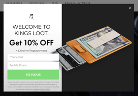
King’s Loot, a wallet brand, establishes its value exchange — 10% off plus a lifetime replacement. Talk about a good deal!
Make sure to establish the value exchange right away in the headline:
Get 10% off your next purchase!
Check out exclusive deals, offers, and product updates!
You can also appeal to shoppers’ emotions by eliciting a sense of urgency, such as describing what they’ll miss out on if they don’tsign up.
Want some tips on writing compelling copy? Check out this guide.
3. Consider the formatting
The way you format your contact capture can have a massive impact on whether shoppers enter their info or say, “No thanks.”
We recommend:
Limiting to five fields.
Using little to no design. Too much text and imagery in a contact capture can backfire — if it looks busy or confusing, shoppers may feel less inclined to work through it.
Making it easy to read — use a large headline that leads to your various contact fields with a clear “submit” button.
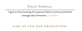
Artemest, a destination for luxury furniture and home décor, keeps its contact capture simple: email address and that’s it.
4. Help them trust you
Through conversations about data privacy and user protection, we’ve all gotten a bit cynical about how companies handle our personal data. To build trust, involve users in the process — don’t ask them to give you their information without telling them what that entails.
To establish trust, be transparent about how you’ll use the email address your customers provide, whether that’s:
Establishing the frequency in which you’ll send them promotional emails or text messages.
Allowing them to check off what types of emails or text messages they want to opt-in to.
Providing a privacy policy page that details how you’ll store their data.
Letting them choose what information they want to share rather than only providing mandatory fields.
And most importantly: Stick to your word. The quickest way to lose a customer is by eroding the trust you've built. For a consumer privacy 101, check out this post.
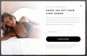
Lounge Underwear’s contact capture establishes how easy it is to unsubscribe from their emails. That’s a huge trust builder, considering unsubscribing to other brands’ emails can sometimes involve a ten-step, anxiety-inducing process.
5. Don’t be too pushy
Nobody likes being nagged. Most shoppers prefer to be in control and dislike aggressive tactics. That said, don’t pester them about handing over their email or phone number. There’s nothing more annoying than a contact capture that pops up on every site page. The purpose should always be to encourage shoppers to build a relationship and connection with your brand.
6. Get creative
There’s no reason you have to rely entirely on pop-ups — interactive contact captures can be a great way to spice it up.
Here are some ideas to get started:
Design an interactive quiz, questionnaire, poll, or game where shoppers can access their results once they complete the contact capture. (It’s also a fantastic way to gather more data for audience segmentation later on.)
Invest in creating high-quality gated content delivered to shoppers’ inboxes once they fill out the contact capture form.
Offer shoppers a chance to participate in a contest or giveaway by entering their information.
Marketing guru Neil Patel uses quiz-based contact captures to collect emails — but he also promises more valuable content to pull users deeper into his brand.
If you go this route, make sure you explicitly state the other ways you'll use the information provided and gather the necessary consent.
7. Consider mobile users
No matter what your contact capture looks like, keep in mind how its features and design will translate for mobile devices.
If your contact capture is too long and doesn’t fit in a phone’s vertical display, you may lose customers with smaller screens. Consider designing a multistep form instead — it’ll reduce form fatigue and make your contact capture less overwhelming.
Go Ahead and Start Capturing
Conventional marketing wisdom says you have eight seconds to grab someone’s attention. So, make your contact captures count. There is tremendous value in spending the time to optimize them, from more sales to better customer engagement to long-term loyalty.
But once you’ve collected someone’s data, the work doesn’t end there. To ensure shoppers don't hit the "unsubscribe" button, you must deliver high-quality, relevant, and genuinely helpful or entertaining content. For that, you’ll need a marketing platform like AdRoll.